
You're in the Monday morning meeting. The screen is full of tiles, trend lines and traffic lights, the director is asking what changed since Friday, and nobody can give a straight answer without opening three other tabs. That's the problem with most reporting and dashboards programmes in UK SMEs, they produce visibility without decision-making.
The fix is not another prettier chart. It's a tighter link between data, ownership, governance and action, with the dashboard used only where it earns its place. In UK businesses, that matters even more because dashboards can drift into regulated processing as soon as they surface identifiable customer, employee or patient data, and the UK GDPR framework retained in domestic law since 31 January 2020 still expects lawful processing, minimisation and access control in the way you handle that information (UK dashboard reporting and GDPR context).
Table of Contents
- The Monday Morning Problem With Most Dashboards
- Defining Reports and Dashboards
- The Four Dashboard Types UK SMEs Actually Use
- Data Sources and the Architecture Behind the Visuals
- Design and Governance Practices That Make Dashboards Trusted
- Choosing How to Build and Run Your Reporting Stack
- A Practical Four-Phase Implementation Roadmap
- Measuring Whether Your Dashboards Are Actually Working
The Monday Morning Problem With Most Dashboards
The owner-manager has the dashboard open before the kettle's boiled. Sales is up, or maybe it isn't, because the figure changed after someone refreshed the page. Finance says one version, operations says another, and the team lead is already reaching for a spreadsheet because the dashboard doesn't tell them what to do next.
That scene is common because teams build for display, not for decision. They add more tiles when they need fewer decisions, more filters when they need clearer ownership, and more colour when they need better governance. The result is a wall of numbers that looks serious and behaves like noise.
The pattern I see again and again
In UK SMEs, the same failure modes keep showing up. The data is stale, the KPI is vanity-based, or nobody owns the number. Sometimes all three happen at once, which is why meetings become debates about definitions instead of actions.
A dashboard should answer a named question for a named role. If it can't do that, it's decoration. A report underneath it is usually more honest, because it shows the detail, the source and the trail that got you there.
Practical rule: if the meeting still ends with “can someone pull the underlying data”, the dashboard hasn't earned its place.
That's especially true in regulated firms, where a clean visual is useless if the underlying metric version isn't clear. Good reporting and dashboards programmes reduce the amount of interpretation people need to do before they act. Bad ones create another layer of work.
The right success measure is blunt. Fewer charts. Faster decisions. Clearer owners. If those three things aren't improving, the dashboard programme is failing, whatever the design looks like.
Defining Reports and Dashboards
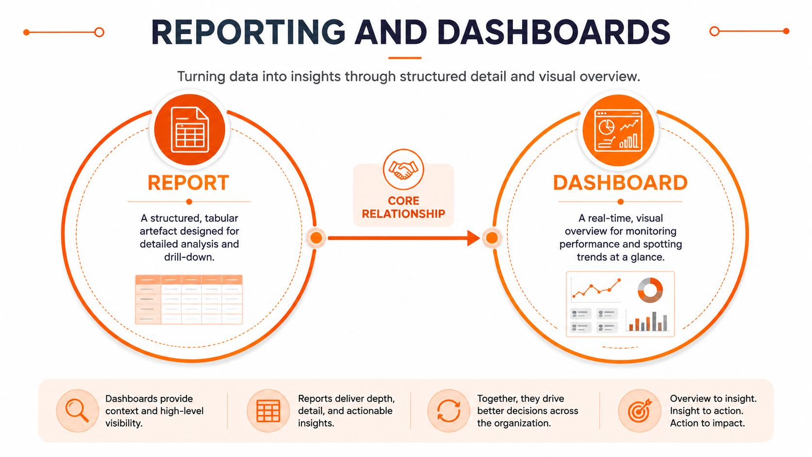
A report is a structured, tabular artefact. It exists for drill-down, auditability and repeatability, which is why finance, operations and compliance teams rely on it when they need the detail. A dashboard is a curated visual summary, built to show the current state quickly so someone can decide what matters next.
A report works like a photo album, full of pages you can inspect one by one. A dashboard works like a wall clock, you glance at it to understand the moment, not to reconstruct the whole day.
The simple test for each object
Use a report when the reader needs evidence, detail or an audit trail. Use a dashboard when the reader needs a current view and can act without opening a dozen rows. When people blur those two jobs together, they usually end up with a dashboard that tries to be both and succeeds at neither.
That distinction matters in the UK data environment. The UK GDPR framework retained in domestic law after 31 January 2020 means any dashboard that surfaces identifiable information becomes part of personal-data processing as well as a presentation layer (UK dashboard reporting and GDPR context). The ICO's security guidance expects appropriate technical and organisational measures, including restricting access to those who need it and protecting confidentiality, integrity and availability.
So the practical rule is simple. If you cannot name the decision the dashboard supports, you do not need that dashboard yet. Build the report first, define the owner, and then decide whether a visual summary will shorten the path to action.
That mindset stops teams from turning every metric into a tile. It also forces you to ask whether the data belongs in a dashboard at all, or whether the more useful artefact is a report with context, commentary and a clear source trail.
The Four Dashboard Types UK SMEs Actually Use
Most UK SMEs don't need ten dashboard categories. They need four that do different jobs, and they need to stop confusing one for another. If you want a useful reference point for the executive style, banking dashboard inspiration is handy because financial views usually show the discipline required when numbers must be trusted quickly.
| Dashboard type | Primary audience | Refresh cadence | Common failure mode |
|---|---|---|---|
| Executive dashboard | Owner, board, senior leaders | Daily or weekly | Too many KPIs, not enough decisions |
| Operational dashboard | Team leads, service managers | Near-real-time or daily | Shows activity, not exception handling |
| Security dashboard | IT, compliance, risk owners | Daily or event-driven | Treats alerts as wallpaper |
| Microsoft 365 usage dashboard | IT, workplace owners, department heads | Weekly or monthly | Tracks usage without business context |
Executive dashboards need fewer metrics, not more
An executive dashboard should show whether the business is on track against the handful of measures that matter at leadership level. It's where lagging indicators belong, because the point is control, not exploration. When this dashboard becomes a dumping ground for every department's favourite number, the board stops using it.
Operational dashboards need exceptions
Operational users need to see what's breaking, what's late and what needs intervention. That means the dashboard should be tuned to leading indicators, thresholds and variance, not a polished summary of yesterday's performance. NHS reporting gives a strong UK example of this approach, because GIRFT-supported analytics are being used across more than 40 specialties and across all acute NHS trusts in England, with national dashboards and monthly performance datasets used as an accountability tool, not a veneer (NHS dashboard reporting model).
Security and usage dashboards serve different masters
A security dashboard is about control, exposure and response. It should help an IT lead see whether authentication, patching or endpoint posture needs attention. A Microsoft 365 usage dashboard is different again, it should tell you whether adoption, licensing or collaboration patterns are aligned to how the business works, not just whether people logged in.
A dashboard that shows activity without ownership becomes background noise. The better question is always, who acts on this and by when?
The key decision is which one you need first. For most SMEs, it's operational. For leadership-heavy firms, it's executive. For regulated organisations, security tends to come early whether they like it or not.
Data Sources and the Architecture Behind the Visuals
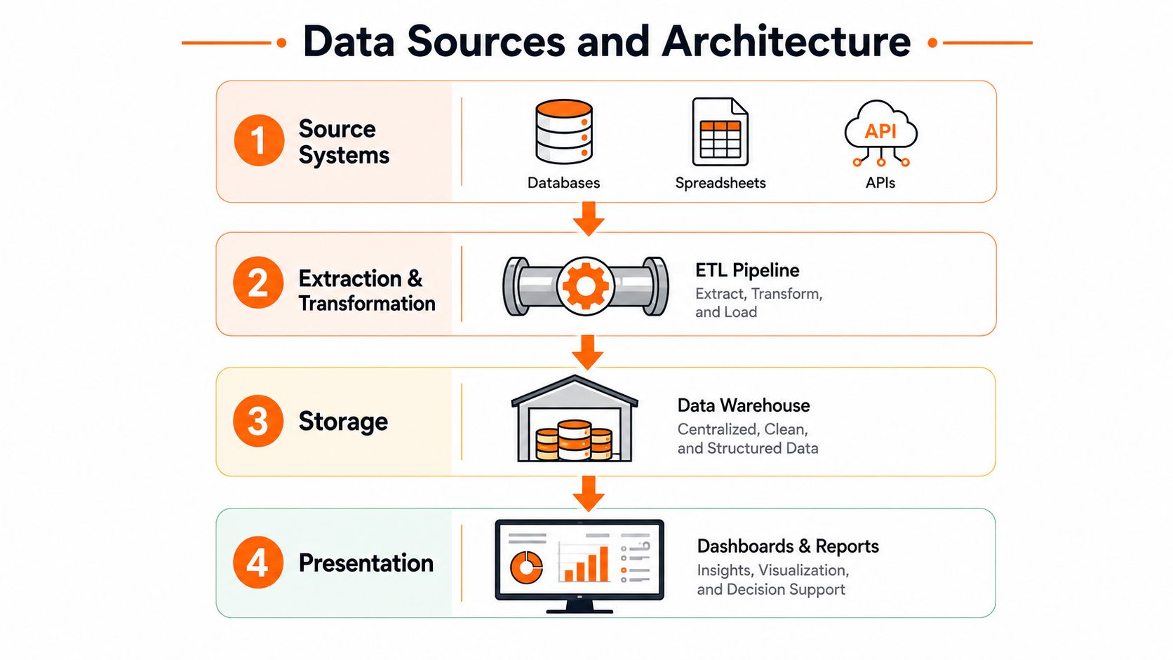
A dashboard only looks simple at the surface. Underneath it, there's a chain of source systems, extraction, transformation, storage and presentation, and if any one of those layers is sloppy, the screen will lie to someone in a meeting.
Start with the source systems. In a typical UK SME, that means ERP, CRM, helpdesk, Microsoft 365 and security tools. The important question isn't how many sources you have, it's which systems of record own the truth for each field.
The pipeline has to be owned end to end
Once data leaves the source, it needs to be extracted and transformed into something consistent. That's where definitions get normalised, duplicates get handled and stale fields get caught. Then it lands in storage, often a warehouse or a model layer, before the presentation layer turns it into dashboards and reports.
If you want a plain-English guide to the integration side of this, the business systems integration guide is a useful internal reference for how the plumbing usually hangs together. The point is not to make the stack complicated, it's to stop the dashboard team pretending the plumbing doesn't matter.
Performance usually fails closer to the browser than people expect
For Salesforce Lightning reports and dashboards, Salesforce recommends 150 ms latency or lower, 3 Mbps download or higher, at least 8 GB RAM and an Octane 2.0 score of 30,000 for the fastest experience, while the minimum supported profile still requires 200 ms latency or lower, 1 Mbps download, 5 GB RAM and an Octane 2.0 score of 20,000 (Salesforce technical requirements). For UK SMEs, that's the clue that reporting pain is often about latency and browser contention, not just bandwidth.
The practical takeaway is direct. If the viewing device is weak, or the WAN is noisy, the dashboard will feel broken even when the backend is fine. Before you buy another licence, check the data path, the browser, the device and the refresh load.
Design and Governance Practices That Make Dashboards Trusted
The best dashboards are boring in the right way. They look consistent, they use clear labels, and they tell each role only what that role needs to know. That's not a design preference, it's what makes the output trustworthy enough to act on.
Build for the role, not for the audience
A role-based, configurable KPI view is the right default. Executives need one shape of summary, managers need another, and operational users need filters that match the decisions they make every day. UK public-sector specifications routinely reflect this separation, with configurable charts, filtering and exportable reports treated as normal requirements rather than luxuries (dashboard role and reporting separation).
That same discipline applies in regulated sectors. A screenshot is not an audit trail. If the metric changed after a transformation or a refresh, people need to know which version is current and where the number came from.
Trust comes from clarity, not decoration
Give every dashboard explicit freshness labels. Lock permissions down to the people who need the view. Make filtering rules obvious. If a chart can be sliced in a way that changes the meaning of the number, say so.
Here's the hard truth. A dashboard that nobody trusts is worse than no dashboard at all. People stop using it, then they build side spreadsheets, then the business ends up with two truths and no confidence.
Accessibility matters for the same reason. Plain-language status summaries help non-specialists, and machine-readable tables alongside visuals help teams interrogate the numbers properly. That broader trust, governance and accessibility problem is exactly why dashboard design can't be separated from data stewardship.
If you want a practical lens on the risk side, the data sovereignty and data security in the UK discussion is useful when you're deciding who should see what and where the data lives. The visual layer should never outrun the permission model.
Choosing How to Build and Run Your Reporting Stack
UK SMEs usually end up with one of three delivery models. They build reporting in-house, buy a SaaS BI tool and run it themselves, or use a managed service provider to design, integrate and operate it. Anything else is usually one of those three with different packaging.
In-house suits small, disciplined teams
If you have a capable data engineer or IT lead, in-house gives you the most control. You can keep definitions close to the business, change reports quickly and avoid waiting on a third party for every update. The trade-off is simple. The business owns the pipeline, the model, the access controls and the maintenance.
That only works if someone really owns it. Without a named owner, dashboards drift, metric definitions blur and users stop trusting the numbers.
SaaS is fast, but it still needs a real owner
Off-the-shelf BI gets you to first value quickly, especially when the source stack is standard and the reporting questions are common. The hidden cost is governance, because the tool does not own your definitions and it will not stop you creating ten versions of the same KPI. If you want to boost business ROI with reporting, automation only helps once the metric design is disciplined.
SaaS works well for teams that want speed and can live with the limits of a generic platform. It fails when the business assumes the tool will sort out messy data, unclear ownership or conflicting source systems.
Managed Delivery for Regulated or Complex Environments
Regulated firms in legal and financial services usually need a managed or hybrid model because access, audit and change control matter more than speed alone. Engineering and manufacturing firms often need an MSP partner because the hard part is not the dashboard front end. It is bringing shop-floor, operational and Microsoft 365 data into one usable view.
A service partner such as Blowfish Technology can sit alongside internal owners in this model, because the company builds and supports custom reporting dashboards that pull operational KPIs and financial summaries from business systems. The when custom business software makes sense guide is the right internal check before you overbuy a generic platform.
My recommendation is blunt. Do not optimise for ownership alone. Choose the model that gives you control, time to value and a way to keep the stack honest after launch.
A Practical Four-Phase Implementation Roadmap
Phase one is audit. Spend 1 to 2 weeks listing the decisions people make, the reports they already trust, and the systems feeding those numbers. Done means one owner is assigned to each KPI and the current data source is named.
Build one pilot before you build a platform
Phase two is pilot, usually weeks 3 to 6. Pick one high-value dashboard tied to one decision, not five. Done means the named user can run the meeting with that dashboard and doesn't need a spreadsheet backup to make the call.
Phase three is harden, typically weeks 7 to 8. Lock access, label freshness, tidy the metric definitions and document what changes the dashboard can and can't support. Governance becomes visible rather than assumed.
Phase four is scale, often weeks 9 to 12. Add the next role, then the next use case, only after the first one has changed behaviour. If the first dashboard didn't alter a meeting, don't expand the programme yet.
For a broader planning lens, the technology roadmap for business growth is a useful internal reference when you're deciding how reporting fits into wider systems work. The checklist to keep on the wall is simple, data sources confirmed, owner assigned, refresh rate agreed, access model reviewed, named decision attached.
Measuring Whether Your Dashboards Are Actually Working
The test is not how polished the tiles look. The test is whether the right person changed a decision this week because of a specific dashboard. If that didn't happen, the programme is underperforming, no matter how elegant the visuals are.
Ask three questions every month. Which decisions moved because of this dashboard in the last 30 days. Who owns each KPI, and how stale is it. What breaks if you turn the dashboard off tomorrow.
The Monday morning screen should get quieter over time, not noisier. When the absence of an alert is meaningful, the dashboard is doing its job.
If your reporting and dashboards still create debate instead of action, Blowfish Technology can help you sort the data plumbing, governance and delivery model before the next bad meeting. Visit Blowfish Technology if you want a practical review of your current reporting stack, from source systems and Microsoft 365 data through to secure dashboards that people can trust.

The Blowfish Technology team. Managed IT, cloud services, software development and connectivity for North West businesses since 1999.